Accessibility Check
For Swagat Grocery
The goal was to run an accessibility check on a website of your choosing using the ATAG Report Tool.
Theme
Accessibility Check & Redesign
Timeline
2 weeks
Role
UX Designer

Check & Redesign
Main Focus on color, typography, & layout (not necessarily animation or navigation unless the accessibility improvements require them)
Google Chrome Web Browser was used to carry out this assessment.
Criteria Check
Level A, AA WCAG 2.1
Conformance Target AA
Tools Used
Wave (Web Accessibility Evaluation Tool)
ANDI (Accessibility Testing Tool)
Manual testing (where the tools lacked the capability to determine the understanding of context, visual cues, and contextual hierarchy, which are essential factors)

Scope of the website
The following pages will be assessed for its accessibility:
Home: https://swagatgrocery.com/
Product: https://swagatgrocery.com/product/t-bas-rice/
Cart: https://swagatgrocery.com/cart/
Is Swagat Grocery's Website Accessible?
Review of WCAG Compliance Says No
Web accessibility conformance evaluation involves both semi-automated tools and manual review. The evaluation in this report was conducted from October 18th to October 31st, 2022, and the website may have been updated since then.
Accessibility Evaluation Report for Swagat Grocery from WCAG EM Tool
Available Here
20/50
WCAG 2.1 Conformance Level
AA Guidelines were tested
02/20
Checked AA Guidelines
Met Requirements
03
Pages of Selected
Wesbite were tested
18/20
Checked AA Guidelines
Failed Requirements
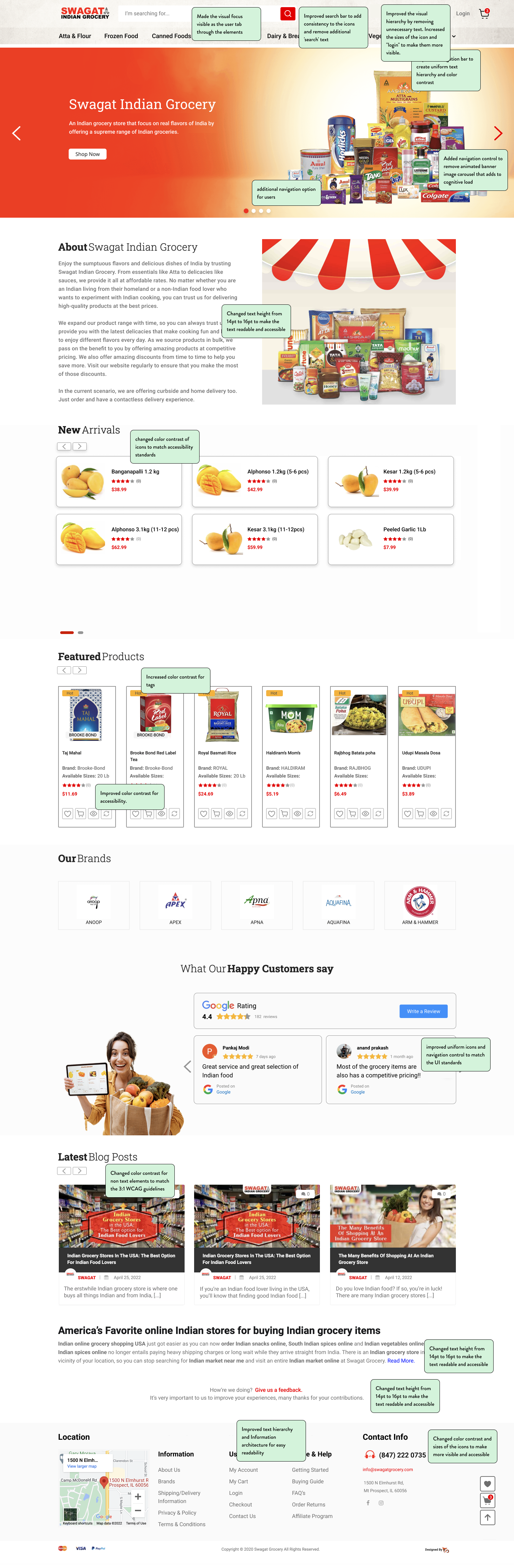
Common to all Pages

Visual Hierarchy,
Text size & Consistency
Site Header & Footer
Non-text Content
1.1.1
Non text elements like icons and action buttons fail contrast check.
Existing contrast -
1.2 : 1
Expected contrast -
3 : 1
Contrast (Minimum)
1.4.3
a. Text
b. non text
Text and non-text contrast failed on all screens.
Existing contrast -
1.2 : 1
Expected contrast for text -
4.5 : 1
Expected contrast for non-text -
3 : 1

Site Header - Updated

Site Header - Before

Site Footer - Updated

Site Footer - Before
Screen 1: Home
Contrast (Minimum)
1.4.3
a. Text
b. non text
Text and non-text contrast failed on all screens.
Existing contrast -
1.2 : 1
Expected contrast for
text - 4.5 : 1
Expected contrast for
non-text - 3 : 1
Pause, Stop, Hide
2.2.2
Hero Banner has flashy animations and fast movements that cannot be paused.
Images of Text
1.4.5
Carousel: The hero banner image has text as image rather than resizable text.

Hero Banner Image - Updated

Hero Banner Image - Before

Intro Section - Before

Intro Section - Updated

Card Structure - Updated

Card Structure - Before
Screen 2: Product

Keyboard Navigation
2.1
a. Highlighting text
b. Skip to main content -
No skip to main content button
c. Keyboard trap -
Website has glitches, user needs to use ‘tab’ multiple times before the focus moves to the next element.
Language of Parts
3.1.2
Add details about the product - Indian foods are not described in a way that is understandable to all.
Identify Input Purpose
1.3.5
Labels on text fields disappear when a user starts typing in. The icons do not help in distinguishing the field either.

Product Page: Part 1 - Updated

Product Page: Part 1 - Before

Ratings and Review Section - Updated

Ratings and Review Section - Before
Screen 3: Cart

Use of color
1.4.1
Breadcrumbs are only based on color, font variations (bold/medium/thin) not used in addition to color
CTAs are treated in same way on a single page, no distinction between primary, secondary and tertiary action.
Info Hierarchy
1.3.1
Cart Structure: The cart page has shipping instructions and charges in red that cannot be distinguished.
Error identification
3.3.1 + 3.3.2
No error on inputing the wrong coupon code

Cart Review - Updated

Cart Review - Before

Cart Totals - Updated

Cart Totals - Before