iFly
Simplifying check-in process for flights, with a 24-hour mobile application flow for hassle-free travel
Theme
Agile, Rapid Prototyping
Role
UX Designer
Timeline
5 weeks

Developers/Product Managers
Challenging team: Presented the scenario
UX Designers
My team’s role
Challenge
Design a high-fidelity prototype for a mobile flight booking app that allows users to check-in for their flight 24 hours before take-off, including the option to upload proof of COVID-19 vaccination. The prototype should include all necessary screens and flow to enable a user to check-in for their husband and son's flight.
Design & Prototype, Testing, Ideate & Refine
Case Study shows above steps
Sprinting to Success: Rapid Timeline of the Prototyping Project!


Design & Prototype
In this Agile challenge, challenging team role-play as developers/product managers and incorporate design changes and additions over two weeks.
Start with Sketches

Fly high and design a seamless experience for the passengers
Day 1
Low-fi Prototyping
Main Flow


Initiated through paper wireframes where basic flow was drawn out with 5 major check-in selections.
Let’s Prototype!
Ideating these wireframes, moved on to low-fi prototyping on Figma, where the flow and basic screen layout was decided, and basic components were created.

Prioritizing consistency over feature enhancement, the design system & UI kit with icons, text styles, and a carefully chosen color palette enables efficient teamwork and consistency for a memorable user experience.
Hi-fi Prototyping
Once the Design System & UI Kit was established, the hi-fi prototypes were created with basic micro-interactions.


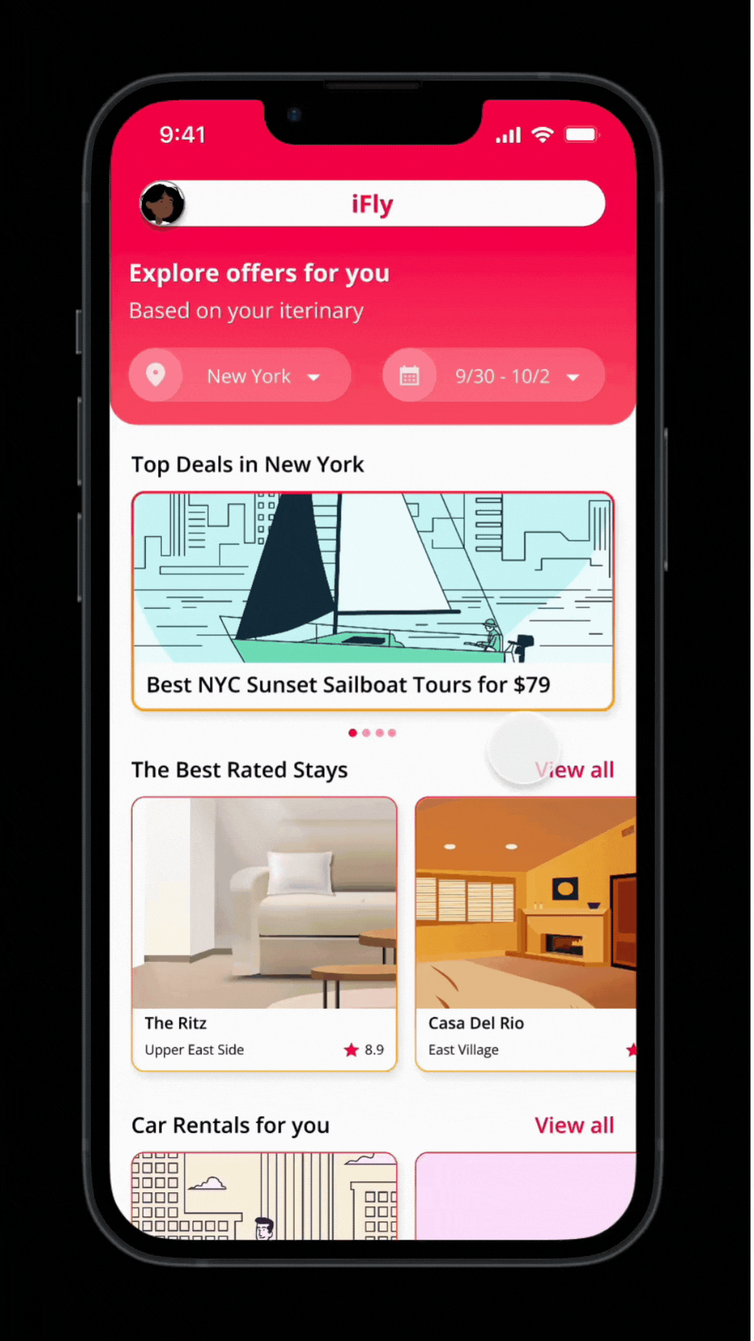
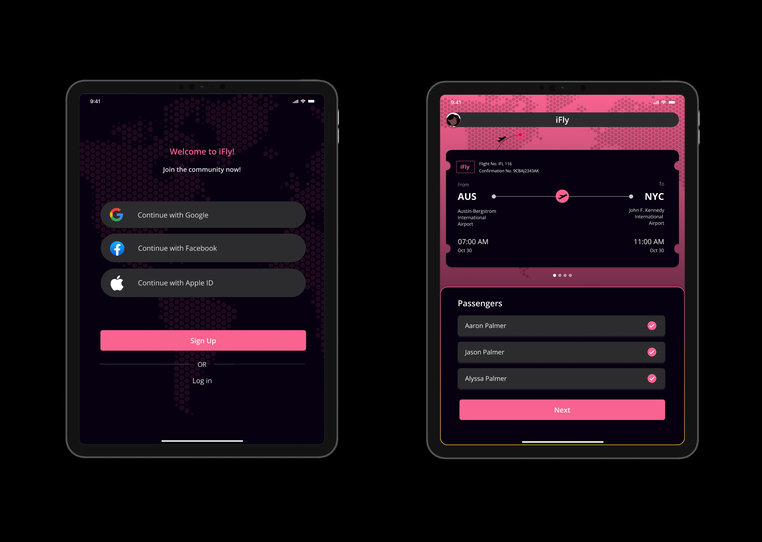
Welcome to iFly.
Log into your account.

All at once.
Multi-passenger Check-In.
Fly Comfortably.
Select your seat.
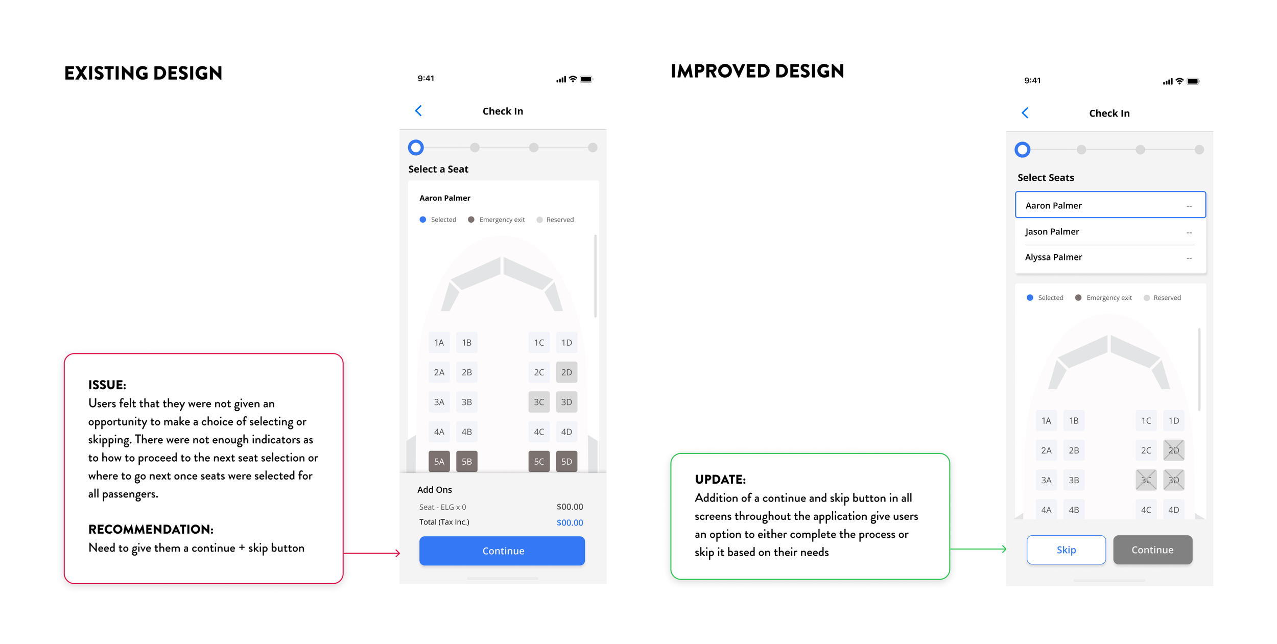
Update 1
Day 4

Travel Ready.
Check Recommendations.
Update 2

Day 7
Let’s Switch to Dark Mode.


Fly Hassle-Free.
Complete Payment.
Travel Ready.
Check Ticket & Recs.
Fly Well Nourished.
Select your meal.
Fly Safe.
Upload Vaccine Proof.


Fly Arms-Free.
Check-in your Baggage.


Day 10
Update 3

Take off with ease!
iFly, now available on your iPad!


Testing
Conduct face-to-face and UserTesting.com usability tests, and extract valuable insights to inform actionable design iteration.
Testing made simple.
Why we chose lo-fi prototypes: No frills, no distractions, just pure UX and flow.
We wanted to make sure our design decisions were based on user feedback and not influenced by visual elements.
Severity rating was assigned to each of the steps in Tasks 1 - 5.
Prototype testing for a better user experience
Using a Likert scale and open feedback sessions, we aimed to learn directly from users about their pain points and desires to make iFly better for all.
Frequent travelers share their insights
We tested with 9 passionate participants, both in-person and online, to get their valuable feedback. From a pilot test to streamlined scenarios, we made sure our participants' voices were heard.


Task 1: Check in Passengers &
Task 5: Select Vaccine Proof
Severity ratings 1-3 for sub-tasks, minor errors
Task 2: Selecting Seats
Severity ratings between 3-5
Multi steps for selecting seats cause confusion and disconnections
Users lacked choice in seat selection and felt confused about what to do next, with unclear indicators for proceeding to the next step
Findings Summary
Task 4: Selecting Meal
Severity ratings between 3-5
No skip option for paid meals - Users had to choose meal options for every passenger individually, but unclear passenger names caused confusion
Task 3: Selecting Baggage
Severity ratings between 4-5
Limited price info frustrates users, they want a detailed cost breakdown for better review.
Confusing continue button - Users fear moving to the next task, not the next user, need better navigation patterns
Ideate & Refine
Analyze and organize findings to define next changes, implement top 3 insights of selected tasks, communicate changes and showcase refined iterations.
Task 2: Select Seat

Task 3: Select Baggage


Task 4: Select Meal


Takeaways
Contrast Check
Update Dark Mode highlighted an issue: our primary color, iFlyPink, didn't pass the AA check for white text.
Keep contrast in mind while creating a color palette and design system.
Multi-Passenger Check-In
Users want individual choice for each passenger, but hate repetitive selection.
Redefining and ideating to solve this.
Agile Sprint in 2 weeks
Time crunch led to quick decisions and agile sprints, yielding positive results despite challenges.
Given more time, we'd add better micro-interactions.
Course
Rapid Prototyping & Lean Methodology, UT Austin, Fall 2022
Team
Sneha Balakrishnan, Rachel Kim, Divya Mirchandani, Rishabh Soni